Color Contrast – all about the difference
Contrast – a definition
Contrast can be defined as “the difference in visual properties that makes an object (or its representation in an image) distinguishable from other objects and the background.” In plain English that could be described at its most basic level as “things which look different from one another” or as the definition taken from Cambridge online Dictionary “an obvious difference between two or more things”.
The real meaning of form is made clearer by its opposite. We would not recognize day as day if night did not exist. The ways to achieve contrast are endless: the simplest are large/small, light/dark, horizontal/vertical, square/round, smooth/rough, closed/open, coloured/plain; all offer many possibilities of effective design
Jan Tschichold, Typographer
“The New Typography”
Contrast – in color
Remember thrusting your hand into a big pail of mixed-up, broken crayons, then leafing through your construction paper to find the perfect hue to go with your chosen sticks of pigmented wax? Or, did you hunt for the perfect piece of paper first, then search for the ideal crayons to go with the paper? No matter how tidy you kept your supplies or in what order you chose them, even at a young age we searched for correct color combinations. “Correct” was something different to each of us, but it often meant finding the right contrast between the background (paper) and the foreground (crayons) so our work would stand out among our classmates’ masterpieces.
Contrast is the perceived difference in colors that are in close proximity to each other. Using contrast effectively not only differentiates your design from others, it’s the essential ingredient that makes content accessible to every viewer.
Value
Dark areas advance, or stand out, while light areas recede, or hang back.
Dark areas also have more weight in terms of balance.
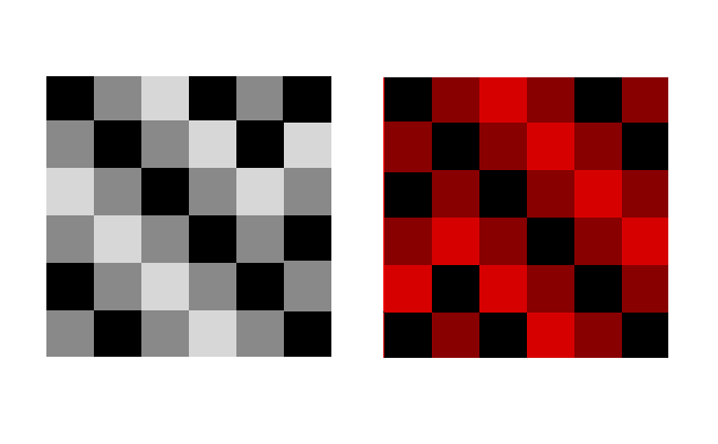
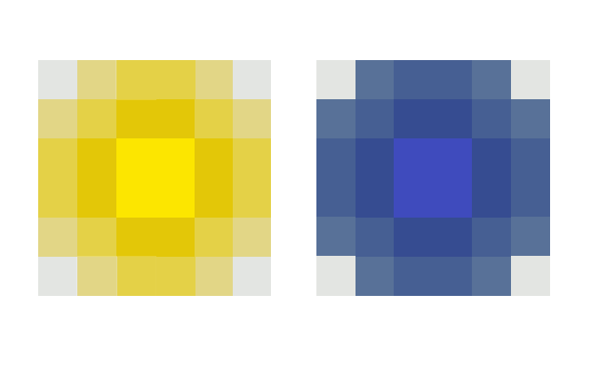
High contrast between light and dark looks dramatic, while more similar shades of gray produces a calm effect.
To emphasize a light element, place it against dark, to emphasize a dark element, place it on a light background.If you squint, your eyelashes screen out the most obvious color differences. Contrast is reduced and you you’ll see what stand out the most. Columns of type will appear gray.
Color
Warm colors — the reds, yellows and oranges — advance, or come forward, while cool colors — blues and variations — recede back.
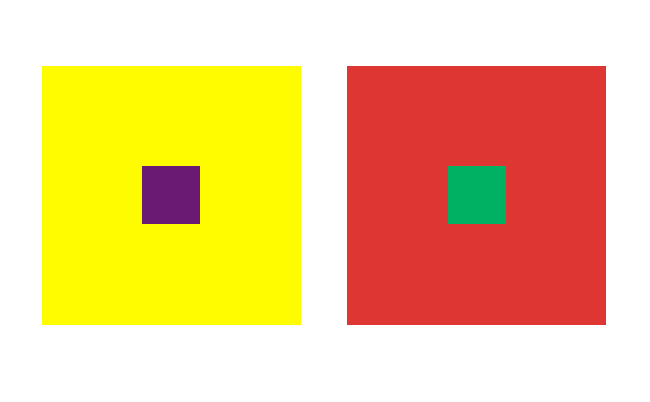
Complimentary colors are opposites on the color wheel. These combinations tend to vibrate if placed against each other. Beware of using purple/orange, red/green, or blue/yellow in combination. Use only for extreme attention-getting devices.
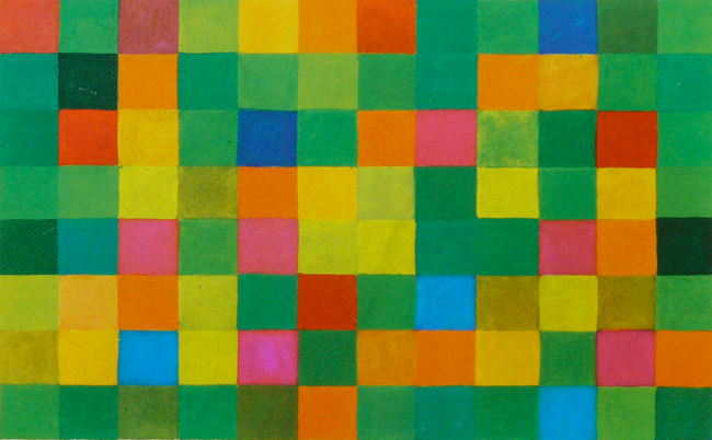
Johannes Itten´s Contrasts in Color
When we survey the characteristics of color effects, we can detect seven different kinds of contrast… Each unique in character and artistic value, in visual, expressive, and symbolic effect; and together they constitute the fundamental resourse of color design.
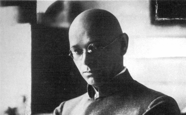
Johannes Itten, Swiss expressionist painter, designer, teacher,
writer and theorist associated with the Bauhaus
Johannes Itten was one of the first people to define and identify strategies for successful color combinations. Through his research he devised seven methodologies for coordinating colors utilizing the hue’s contrasting properties. These contrasts add other variations with respect to the intensity of the respective hues; i.e. contrasts may be obtained due to light, moderate, or dark value. Learn these contrasts to become an even better graphic designer.
The Pure Color (Hue) Contrast
This results when pure colors are used in random combinations. White and black can further enhance the vivid effect.
The Light-Dark Contrast
This is based on the use of different brightnesses and tone values of the colors. All colors can be lightened with white, and darkened with black.
The Cold-Warm Contrast
It´s greatest effect is achieved with the colors orange-red and blue-green. All other colours appear cold or warm depending on their contrast with warmer or colder hues.
The Complementary Contrast
In the color circle the complementary colors occupy opposite positions. When they are mixed, the result is a neutral grey-black. When adjacent, complementary colors mutually intensify their luminosity to a maximum; when mixed, they extinguish each other to produce grey-black.
The Simultaneous Contrast
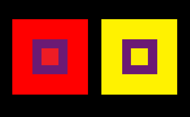
Its effect is derived from the law of complementary colours, according to which each pure colour physiologically demands its opposite colour – its complement. If this colour is absent, the eye will produce it simultaneously. Strong green makes neutral grey next to it appear reddish-grey, whereas the effect of strong red on the same grey is a greenish-grey appearance.
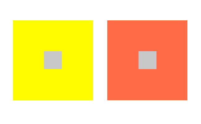 The two pure color squares contains a small neutral grey square, matching the background color in brilliance. Both grey squares seems to be tinged with complimentary color of the background. The simultaneous effect becomes more intense, the longer the principal color of a square is viewed.
The Contrast of Quality (Color Saturation)
This is the contrast between luminous and dull colors. Colors can be subdued by the addition of black, white, grey, or complementary colors.
The Contrast of Quantity
This is based on the opposition of colored areas of different sizes.
How to use Contrast in Color
To evaluate a designs contrast while it’s still in the design stage, use an image manipulation tool, such as Photoshop, and view the design in grayscale versus RGB/CMYK.
- If you are not experienced in working with color, keep color schemes conservative, conventional, and simple.
- Use subtle shades of natural colors.
Subtle colors found in nature also make the best choices for most background or minor elements, especially if type appears on the color.
- Avoid bold, highly saturated primary colors except in areas of maximum emphasis, and even then, use caution.
- Choose colors from an analogous palette, or colors that reside on the same quadrant of the color wheel.
- Type must always contrast sharply with background colors to be readable, but not too sharp to ease the impact on readers eyes.
The specific definition of color contrasts are not as important as making sure you include appropriate contrast as part of your design process. This will allow viewers, no matter how they interpret colors, to read and enjoy your design. Just as choosing the correct color combinations when you were a child would help your picture stand out in a sea of your classmates’ work, choosing correct color combinations when you design will allow your work to stand out in the world of graphic design.
Literature:
- The Elements of Color, Johannes Itten, John Wiley & Sons; 1 edition (January 31, 1970), ISBN-13: 978-0471289296
- The New Typography, Jan Tschichold, University of California Press (November 30, 1998), ISBN-13: 978-0520071476
- Principles of Form and Design, Wucius Wong, Wiley; 1 edition (September 15, 1993), ISBN-13: 978-0471285526

