Typography – The Anatomy of Letters
Typography – The Anatomy of Letters
Typography inspires us by reminding the world of a simpler time without connection. As designers, we can carry that fascination into our work by studying the makeup of letters
The detection of types is one of the most elementary branches of knowledge to the special expert in crime.
-The Hound of the Baskervilles, 1902
Introduction
Our modern alphabet is a child of the Latin alphabet or Roman alphabet. These alphabets evolved from a western version of the Greek alphabet approximately 2,700 years ago. The profession of typography was essentially born in Germany. In the early 1450s Johannes Gutenberg’s invented the movable metal type printing press.
The individual pieces of metal type that Gutenberg worked with were not letters, but letterforms.
There is a subtle but important difference in meaning between a grapheme, character or letter and a glyph, letterform or sort. A letter, character or grapheme refers to a fundamental conceptual mark that represents a spoken sound. (A phoneme refers directly to the sound.)
A sort, letterform or glyph refers to a particular manifestation of a letter or character, one created by a type designer.
The Anatomy
Serifs
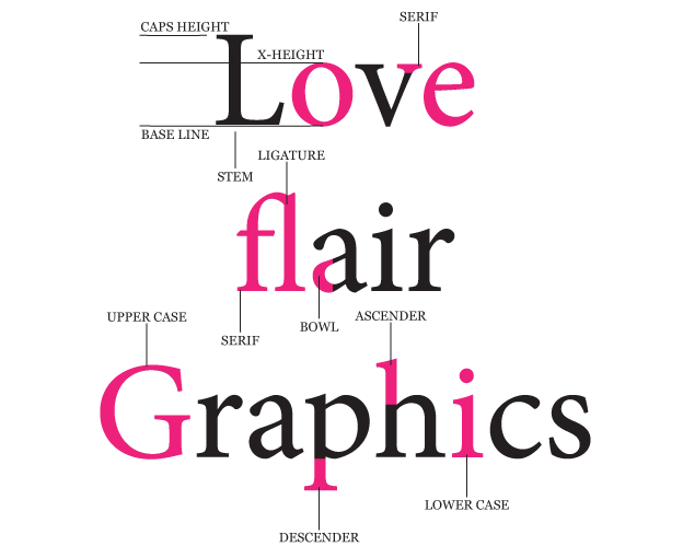
Serifs can be defined as ‘the little feet on the letters’. Serifs are finishing flourishes at the ends of a character’s main strokes, where the stroke appears to flare out.
The classification of the innumerable variations in type design existing today begins with the existence or non-existence of these little feet. A difference which have existed as a crucial detail on most Roman letterforms for a little over 2000 years.
The word “Serifs” is of dubious origin, but it probably comes from an old German word for the stroke of a pen. Serifs themselves, though, are extremely ancient and can be found in stone inscriptions from at least as far back as ancient Greece. One of the basic ways of categorizing typefaces is to distinguish those with serifs—seriffed faces—from those without.
Serifs are not just decorative fillips. They are important visual aids that help the eye to differentiate one character from another, and to help the brain distinguish individual characters from among the forest of tiny strokes that make up passages of typeset text. They also provide a slight horizontal texture to type, creating a sort of graphic current to draw the eye along the line. The characters of seriffed text are thus somewhat more legible, or easier to recognize. The added legibility, in turn, makes text easier and faster to read, that is to say, more readable.
There are many kinds of serifs, varying widely in shape, size, and bulk.They have evolved over the ages, and styles of type are often named for the distinctive forms of their serifs.
Sans-Serifs
Type without serifs occurred in Roman times, but it was rare and is seldom seen. In the early nineteenth century sans serif typefaces re-emerged. Perhaps as an evolutionary branch away from the Egyptian or slab-serif fonts that were popular at the time. At first these new letters were described as grotesque or grotesk types, perhaps because they seemed incomplete and ugly, and these terms are still among those used to describe sans-serifs today.
Sans serif types tend to be used in display roles, such as for titles and other large type, although a few sans serif faces are often used for text. Those are usually humanist sans faces, whose designs were inspired not by geometry but by classical and Renaissance letterforms. Optima is one such humanist sans serif often used for setting long texts.
Many of the most popular sans serif faces came from the pioneering work of the designers at the Bauhaus, the German design school that became a hotbed for cutting-edge design between the world wars. One of the design imperatives of the Bauhaus was to strip away useless ornamentation and reduce objects to their functional minimum, in the belief that pure functionality had a beauty and an aesthetic importance of its own. One Bauhaus concern was the redesign of the alphabet, and many popular typefaces eventually grew from the roots of this research. One of them is Paul Renner’s Futura, which through various revisions and refinements has remained popular
Ascenders and Descenders
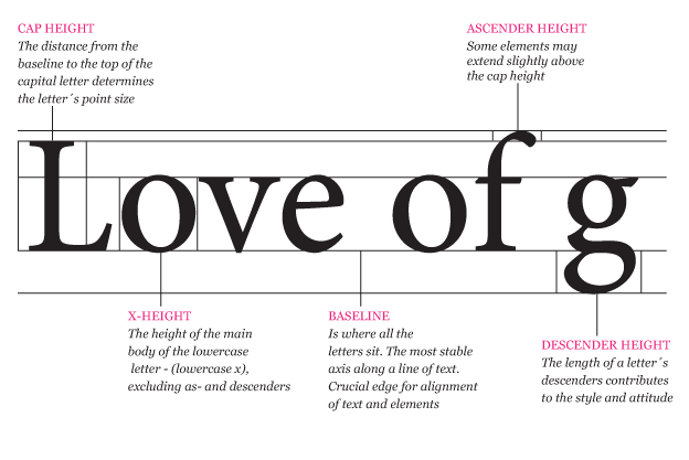
An invisible grid of parallel horizontal lines is used as a constant reference in typography.
It resembles a musical score and its four (or five) horizontal lines represent, from top to bottom, the ascender line (the height of the highest ascender), which is sometimes equivalent to and sometimes higher than the ascent or cap line (the height of the capital letters).
Next comes the mean line or waist line (the height of a lowercase x), which can be referred to as a high waist line or a low waist line; the baseline (on which the letters appear to rest); and finally, at the very bottom, the descent, descender or beard line (the level to which the lowest descenders descend).
 Ascenders are the parts of some lowercase letters that rise above the meanline, and descenders are, conversely, the parts of some lowercase letters that fall below the baseline.
The ascenders and descenders of a given typeface may be described as long, normal or short. There are a number of self-descriptive terms for the relative distances between the lines on this typographic grid, such as the p height, the k height, the H height or cap height, and, most famously, the x height or body of a typeface.
The lowercase letters, which, like the x, have no ascenders or descenders, are known as the primary letters. The uppercase or capital letters are the 23 capitalis monumentalis invented by the Romans, plus three characters that were added to the alphabet later: U and W, about a thousand years ago, and just 500 years ago our youngest letter, J was born.
Ligature
A ligature is a single sort in which two or more letters are joined, usually to improve the space between them. There are a few ligatures that are still seen today, such as the connected fi, fl, the triple play ffl, and sometimes even the stylish ct ligature. A typographic diphthong is a glyph of two vowels spliced together, and it symbolizes a phonemic diphthong, two linked vowel sounds. Ligatures and diphthongs are also known as tied characters, tied letters, and sometimes quaints.


