What are the most important typography terms? Readability and personality. Typography is to convey correct information to the audience effectively. To achieve this purpose, readability plays an essential role. Readability refers to multiple aspects, including font size, font type, font weight, font color, leading and tracking. The key factor to improve readability is building clear hierarchy, which […]
Legibility and readability both relate to the ease and clarity with which one reads any particular setting of type, but they actually refer to two different concepts. When most people look at a page, they don’t see typefaces and they don’t see type. They see words. They’re not admiring the page—they’re reading it, and reading […]
Free typography ressources for you. Typography isn’t just the frosting on the doughnut that is your text. Typography has consequences. That’s why I’ve gathered a list of the best free typography resources just for you. So you can keep elevating your designs through typography. Free Typography Education E-courses, e-books, and more to start your […]
When it comes to making a typeface combination, there are principles and methods, but no absolutes. You can’t apply all these principles or ideas at the same time. Just browse this list of ideas and see what strikes you as interesting, and then try it! 1. Combine a serif and a sans serif […]
Good typographic design is mainly a combination of common sense and keeping things simple remembering a few rules. Typographers will tell you to eliminate widows and orphans. Typographers are MONSTERS! Look at attractive examples of typographic designs that are similar to what you’re trying to create. The following list explains some basic rules. One […]
One of the best methods to decide which typeface to use is to have a clear understanding of its application. Will the type be digital or in print? Will it require a range of weights and postures? If it requires a variety of fractions and numerals, does the typeface have a complete set of OpenType […]
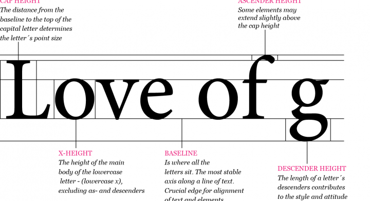
Typography – The Anatomy of Letters Typography inspires us by reminding the world of a simpler time without connection. As designers, we can carry that fascination into our work by studying the makeup of letters The detection of types is one of the most elementary branches of knowledge to the special expert in crime. […]
Typesetting – All About Space Typography and typesetting is a game of controlling spaces, so its tools are all keyed to precise measuring. Because of the intimate scale in which typographic adjustments are made, type’s measurements have evolved independently of the coarser units used for other forms of craft or commerce. Although the metricsystem has […]
When designing for the screen, people tend to underestimate the importance of type. You would be wrong to think that only print designers have to kern, adjust, weight and organize type meticulously. That’s exactly what separates semipro’s from high standard professionals. Let’s talk about minuteness for a bit. It is strictly a lie that motion […]
Rhythm is a state of movement that is generated from within the composition. It need not to be formal, but it must convey the graphic designer´s intent.
Typographic Rhythm
All rhythm is supported by secondary forces – undercurrents that often go unnoticed, but nonetheless energize the overall dramatic intent.
In typography these secondary forces are the eddies found within the shapes of letters.


