Typography Guidelines for Motion Designers
When designing for the screen, people tend to underestimate the importance of type. You would be wrong to think that only print designers have to kern, adjust, weight and organize type meticulously.
That’s exactly what separates semipro’s from high standard professionals. Let’s talk about minuteness for a bit.
It is strictly a lie that motion designers don’t have to spend hours on adjustment and alignment on type.
It is starkly a lie that motion designers don’t have to kern, weight and organize type.
Obviously, we can’t bring typography to perfection for every single frame, but the important key frames should show a sense of aesthetics when it comes to typography.
I’ll share with you the do’s and don’ts of typography used in animation
Do’s and Dont’ s of Typography in Animation
Do: use sans serif fonts when the type you are displaying is not easily legible due to terms of timing or composition. Serif fonts are harder to read and become a plight rather than the originally intended information bearer.
Always keep in mind that you are designing for the screen. In opposition to printed work, the user can easily resize your screen design, and you sure as hell do not want to lose your serifs due to the user’s high screen resolution. Using sans serif typefaces retains the readability even at smaller font sizes.
Don’t: stretch fonts disproportionally. The thick strokes will get way out of proportion fast, so will the curvatures. Squeezing type could even put your job in jeopardy.
Do: limit yourself to two or three different typefaces per piece of art. More than that will destroy the feeling of a clear concept and make you look like an amateur. This tip is generally held as a basic guideline for typography in any media, whether its print design or web design typography.
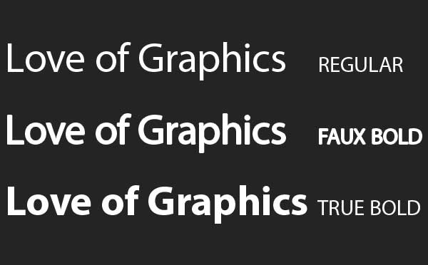
Don’t: use faux italic or faux bold. Those are the buttons for bold and italic in Photoshop and any other Adobe product. They will try to simulate the type style of the font but never succeed entirely as it can’t elicit what the intention of the font’s creator was. And yes, in most cases, faux italic and faux bold are noticeable.
Instead, look for the typeface’s italic or bold style. In the example below, you can see the difference between the real versus the faux bold style.
Do: kern your type. A big leap between L and T, for example, simply looks foul. Use your Alt/Option key in combination with the arrow keys to change the kerning between letters in any product of Adobe.
Don’t: make text oriented vertically unless you’re targeting an audience that is accustomed to reading them this way. Especially in animation, it is irritating and takes time to read since most viewers are used to reading from left to right.
Do: use a grid to align your type elements. Relate them to each other in size and position and make sure the spaces between them are equal or follow the same pattern. Use tracking and leading to bring the spacing to perfection.
Don’t: use Comic Sans or Papyrus. We don’t care how funny they might look. Do not ever use them. Since Microsoft released Comic Sans back in 1994, it has been used in any possible (unintended) way.
It was originally designed to imitate Comic book lettering, and that’s the only occasion you should ever even consider using it. And even then—you’re better off with another font.
Summing Up
Don’t look at type as if it is a “must”, but rather, see it as another powerful graphical element that will not only help to convey your message and information, but also support the overall visual impression. And—when worse comes to worst—you can still ask Max Kerning.


