What a new designer should know about typography
What are the most important typography terms?
Readability and personality.
Typography is to convey correct information to the audience effectively. To achieve this purpose, readability plays an essential role.
Readability refers to multiple aspects, including font size, font type, font weight, font color, leading and tracking. The key factor to improve readability is building clear hierarchy, which means creating strong contrast. In general, we make the most important information stand out most.
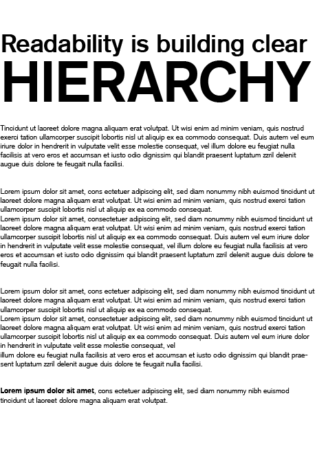
For example, if we need to make the title stand out, we can make the contrast stronger by reinforcing the title or weakening the rest part visually (See image 1 below).

Image 1
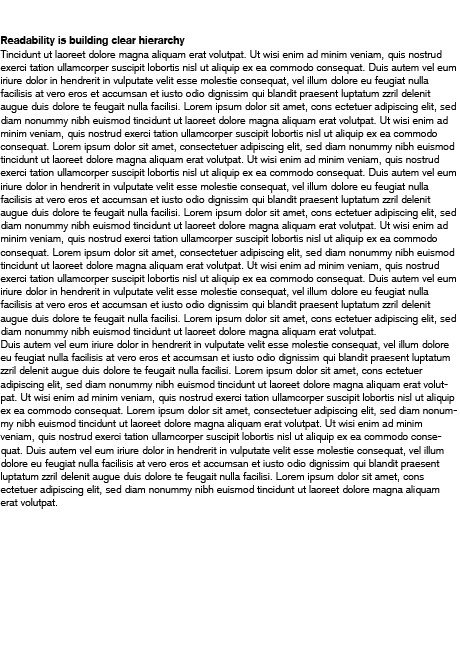
A lack of hierarchy ruins the reading experience and will be frustratingly noticeable for audiences (See image 2 below).

Image 2
Great typography should be invisible
Personality is more about the visual look of font. Everything needs to fit well each other to keep the whole style consistent. Picking the “right” font can bring the overall typography to a new level. For example, branding for an elegant luxury brand might make serif the best choice, whereas a technology company’s website might be better suited to sans serif.
What is a useful term in typography?
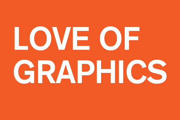
Alignment is one of the basic principles in typography to make the text looks organized. Keeping the text in a “box” is an acceptable way to make everyone happy, but it’s usually hard for us to keep the text in a “perfect box” due to the given content from the clients. (See image 3)

Image 3
How to make it work?
1. Adjust font size
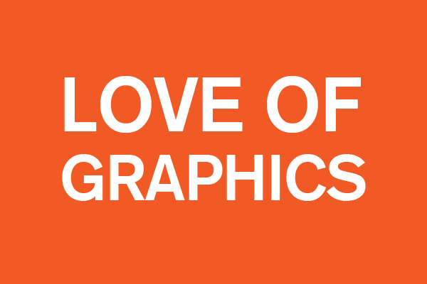
We can adjust font size to fill the gap. (See image 4)

Image 4
2. Add corresponding elements
What if we receive the feedback from the client said that they want to keep the font size the same since every word is important? No worries, we can also add elements to fill the space, like shapes or symbols. These elements have to fit the overall style for sure. (See image 5)

Image 5
What should new designers know in terms of typography when they begin their careers?
If you are a design student, when you transit from a student to a designer in the industry, switching your think mode would be very helpful to your career.
Design is more than creating beautiful images, it’s more about solving problems.
If you can think from the client’s perspective, you would know what their need is, which makes your design direction more accurate and your work more efficient.
One more tip in terms of typography is using no more than two font types or font colors and using relative big font size. Why? As it makes the design clean, neat and readable. Most of the clients don’t like taking risks. They want their designs look “safe”, so creating readable typography is the safest way. They want their information to be conveyed clearly and correctly to the target audience. That is why readability is one of the most critical typography terms.


